You can collect typed or handwritten electronic signatures from your users using a signature field. When an entry with a signature field is submitted, the signature appears as an image alongside the rest of the entry information (as well as PDF exports).
Piotnet’s signature field allows you to collect user signatures online. They can use their touchscreen devices, mice, or touchpads to submit the digital signature field. To digitally optimize a signature, you do not need to purchase any additional plugins or tools.
How to add Signature field to your Forms
Now that you have your form builder already or you need create a new form.
After creating the form, make sure you have all the input fields that you need. Piotnet Addons offers a lot of feature including essential fields like name field, custom HTML, hidden field, mask input, custom submit button, etc.
And when you have the signature add-on, you will have an additional signature field among the advanced fields. Simply drag it, and drop it onto the form.
Save the form, and you’re done!

Related Information

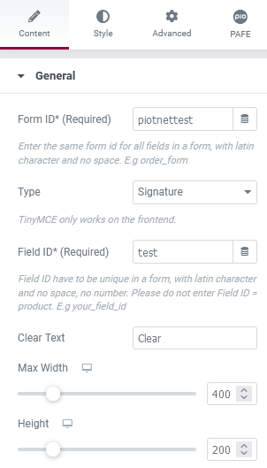
Form ID: Applying only one Identity of the Form value is a basic mandatory in order for your Form to work normally. Enter the same Form ID for all fields in a form.
How to name your Form ID: Be aware that you can use only Latin characters for this name. Numbers and underscores are also acceptable but do not leave spaces. If you want to use multiple words to name the field, divide them with an underscore.
E.g., order_form (use an underscore instead of a dash/hyphen)
Type: Choose Signature field type
Field ID: The identity of the Field has to be unique in a Form. Duplicated Field IDs will make your Form not work properly.
How to name your Field ID: Be aware that you can use only Latin characters for this name. Numbers and underscores are also acceptable but do not leave spaces. If you want to use multiple words to name the field, divide them with an underscore. Furthermore, please do not enter Field ID = product.
E.g., your_field_id (use an underscore instead of a dash/hyphen)
Shortcode: You could get the input data of the field by embedding this shortcode into an email or other actions in Submit Button
Clear Text: The title of the clear button.
Max Width: Adjust the width of the Signature Box.
Height: Adjust the height of the Signature Box.
Label: It is a name that appears above the field bar and is visible to users.
Show Label: Depending on your purpose, you can show the Label of the field or not by this function.
Inline Label: As the name of the function, it helps your Label and input field be placed in the same row.
Required: When you enable this function, a website visitor obviously must fill out/choose options in this field. Once the user ignores it, the system will warn by a default message.
Required mark: Show the mandatory mark right on the Label
Live Preview Code: You can show the input data to show up directly on your Form. To get a demo, please click here

Invalid message: an error notification will show up to alert when the format of input data is incorrect.
Autocomplete: The Autocomplete function provides suggestions while you type into the field.
Remove this field from Repeater: Apply for Repeater function.
Remove this field from email message: Apply for Email Action depending on specific option values. For example: when a website user chooses a particular option, and you do not want to show this field in email by this option.

You can implement an Icon from our default icon media and are able to customize the width, size, position, and color of the icon.
 Label
Label
You can customize the Label elements: Space between Label and Content, Text Align, Text Color, Typography
 Field
Field
You can customize the Content Elements: Text Align, Text Color, Typography, Background Color, Input Max Width, Input Padding, Input Placeholder Color, Input Placeholder Typography, Border Type, Border Type, Border Type, Border Radius, and Box Shadow.
 Layout
Adjust Margin, Padding, Width, Position, Z-index, CSS ID, CSS Classes
 Motion Effects
Scrolling Effects, Mouse Effects, Sticky: None, Top, Button, Entrance Animation
 Transform
You can set both normal and hover styles for elements: Rotate, Offset, Scale, Scale, Flip Horizontal, Flip Vertical
 Background
You can set both normal and hover styles for Background Type.
 Border
You can set both normal and hover styles for Border Type, Border Radius, Box Shadow
 Mask
Mask
Adjust the Shape, Size, Position or Repeat
 Responsive
Responsive visibility will take effect only on the preview or live page, and not while editing in Elementor.
You can hide it on your Desktop, Tablet, or Mobile.
 Attributes
Set custom attributes for the wrapper element. Each attribute in a separate line. Separate attribute key from the value using | character.
 Custom CSS
Add your own custom CSS here


