A honeypot field is a field added to the form that the users can’t see due to CSS or JavaScript (which hides the field). Honeypots are awesome because they don’t inconvenience users like a captcha and they are a valid tool for thwarting spam bots. Basically, a spambot fills in a field that valid users can’t see, alerting us to their activity. If the honeypot field is filled in, we can confidently reject the form as spam.
After the honeypot field was invented, the spambot authors got a little smarter. They added some code to detect these hidden fields. If the name of the field is always the same, then the honeypot field is really simple to detect.
How to add Honeypot field for your form
Besides designing your form, you can also make changes to an existing one.
You can then add fields to your form from here. You are free to be as inventive as you want, creating anything from a Simple Contact form to a Survey. Fill in as many or as few fields as you need.
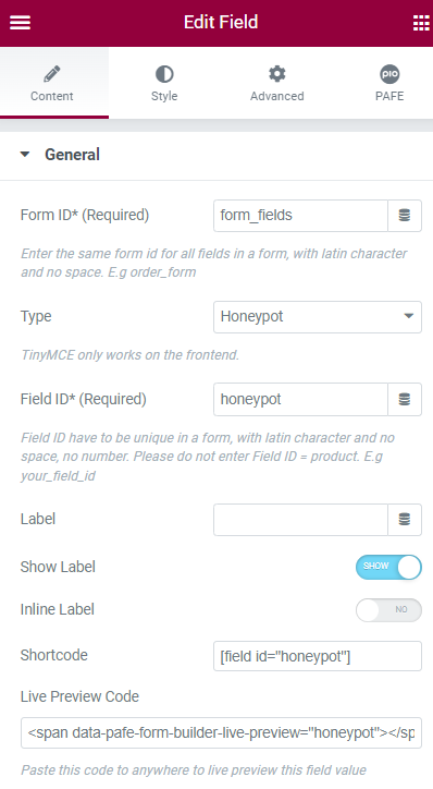
Then, simply drag and drop the Field widget into the form and change the field type to Honeypot field.

Related Information

Form ID: Applying only one Identity of the Form value is a basic mandatory in order for your Form to work normally. Enter the same Form ID for all fields in a form.
How to name your Form ID: Be aware that you can use only Latin characters for this name. Numbers and underscores are also acceptable but do not leave spaces. If you want to use multiple words to name the field, divide them with an underscore.
E.g., order_form (use an underscore instead of a dash/hyphen)
Type: Choose Hidden
Field ID: The identity of the Field has to be unique in a Form. Duplicated Field IDs will make your Form not work properly.
How to name your Field ID: Be aware that you can use only Latin characters for this name. Numbers and underscores are also acceptable but do not leave spaces. If you want to use multiple words to name the field, divide them with an underscore. Furthermore, please do not enter Field ID = product.
E.g., your_field_id (use an underscore instead of a dash/hyphen)
Label: It is a name that appears above the field bar and is visible to users.
Show Label: Depending on your purpose, you can show the Label of the field or not by this function.
Inline Label: As the name of the function, it helps your Label and input field be placed in the same row.

Autocomplete: The Autocomplete function provides suggestions while you type into the field.
Remove this field from Repeater: Apply for Repeater function.
Remove this field from email message: Apply for Email Action depending on specific option values. For example: when a website user chooses a particular option, and you do not want to show this field in email by this option.

You can implement an Icon from our default icon media and are able to customize the width, size, position, and color of the icon.

You can customize the Label elements: Space between Label and Content, Text Align, Text Color, Typography

You can customize the Content Elements: Text Align, Text Color, Typography, Background Color, Input Max Width, Input Padding, Input Placeholder Color, Input Placeholder Typography, Border Type, Border Type, Border Type, Border Radius, and Box Shadow.

Adjust Margin, Padding, Width, Position, Z-index, CSS ID, CSS Classes

Scrolling Effects, Mouse Effects, Sticky: None, Top, Button, Entrance Animation

You can set both normal and hover styles for elements: Rotate, Offset, Scale, Scale, Flip Horizontal, Flip Vertical

You can set both normal and hover styles for Background Type.

You can set both normal and hover styles for Border Type, Border Radius, Box Shadow

Adjust the Shape, Size, Position or Repeat

Responsive visibility will take effect only on the preview or live page, and not while editing in Elementor.
You can hide it on your Desktop, Tablet, or Mobile.

Set custom attributes for the wrapper element. Each attribute in a separate line. Separate attribute key from the value using | character.

Add your own custom CSS here


