
 General
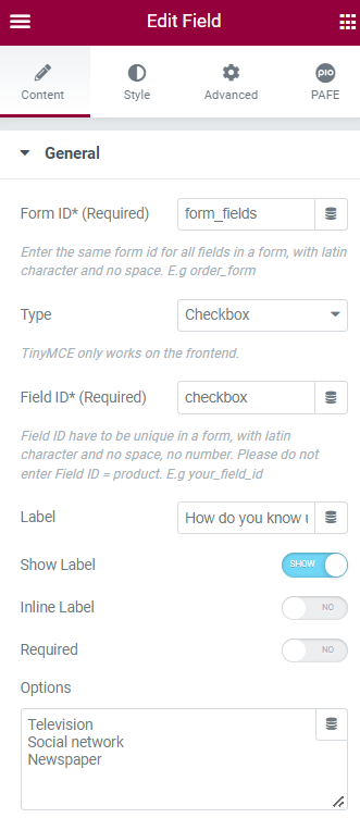
Form ID: Applying only one Identity of the Form value is a basic mandatory in order to make your Form work normally. Please notice that the same Form ID is used for all fields in a form.
How to name your Form ID: Be aware that you can use only Latin characters for this name. Numbers and underscores are also acceptable but do not leave spaces. If you want to use multiple words to name the field, divide them with an underscore.
E.g., order_form (use an underscore instead of a dash/hyphen)
Type: Choose Checkbox
Field ID: Identity of the Field has to be unique in a Form. Duplicated Field IDs will make your Form not to work properly.
How to name your Field ID: Be aware that you can use only Latin characters for this name. Numbers and underscores are also acceptable but do not leave spaces. If you want to use multiple words to name the field, divide them with an underscore. Furthermore, please do not enter Field ID = product.
E.g., your_field_id (use an underscore instead of a dash/hyphen)
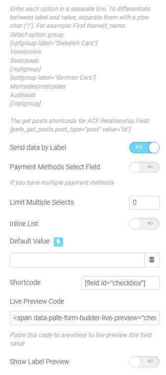
Shortcode: You could get the input data of the field by embedding this shortcode into a hidden field, calculated field, email, or other actions in Submit Button
Label: It is a name that appears above the field bar and is visible to users.
Show Label: Depending on your purpose, you can show the Label of the field or not by this function.
Inline Label: As the name of the function, it helps your Label and input field be placed in the same row.
Required: When you enable this function, a website visitor obviously must fill out/choose options in this field. Once the user ignores it, the system will warn by a default message.
Required mark: Show the mandatory mark right on the Label
Options: Fill out your options here, follow the Label|Value format. Enter each option in a separate line. To differentiate between label and value, separate them with a pipe char (“|”). Implement alphabet characters right behind the same values. You can perform calculations with a letter appended to the numerical value.
Send data by label: Apply for Email action. You will receive the Label instead of Value in default.
Payment Methods Select Field: Enable this function If you have multiple payment methods
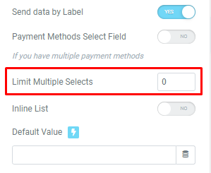
Limit Multiple Selects: If this setting is enabled, the website visitor must choose the setup minimum options
Inline list: arrange the option labels to be placed in the same row.
Default value: The data you place here will be automatically added to the field. Users are able to change it; however, this information will be added if users do not replace it.
Live Preview Code: You can show the input data to show up directly on your Form. To get a demo, please click here
Show Label Preview: Label will be displayed instead of Value in default.
Other Options
Invalid message: an error notification will show up to alert when the format of input data is incorrect.
Autocomplete: The Autocomplete function provides suggestions while you type into the field.
Remove this field from Repeater: Apply for Repeater function.
Remove this field from email message: Apply for Email Action depending on specific option values. For example: when a website user chooses a particular option, and you do not want to show this field in email by this option.
Automatically move to the next step after selecting – Multi Step Form: Instead of clicking Next Button to skip a step.
Icon:
You can implement an Icon from our default icon media and are able to customize the width, size, position, and color of the icon.
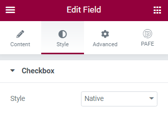
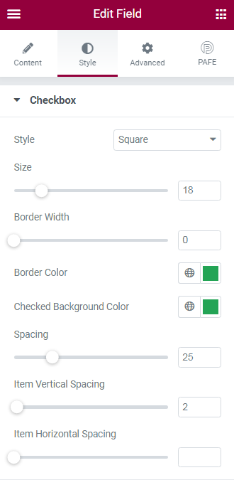
Checkbox
Style: There are two styles for Acceptance field type: Native and Square.
You can customize Size, Border Width, Border Color, Checked Background Color, Space, Item Vertical Spacing, Item Horizontal Spacing when applying the Square style.
Label
You can customize the Label elements: Space between Label and Content, Text Align, Text Color, Typography
Field
You can customize the Content Elements: Text Align, Text Color, Typography, Background Color, Input Max Width, Input Padding, Input Placeholder Color, Input Placeholder Typography, Border Type, Border Type, Border Type, Border Radius, and Box Shadow.
Layout
Adjust Margin, Padding, Width, Position, Z-index, CSS ID, CSS Classes
Motion Effects
Scrolling Effects, Mouse Effects, Sticky: None, Top, Button, Entrance Animation
Transform
You can set both normal and hover styles for elements: Rotate, Offset, Scale, Scale, Flip Horizontal, Flip Vertical
Background
You can set both normal and hover styles for Background Type.
Border
You can set both normal and hover styles for Border Type, Border Radius, Box Shadow
Mask
Adjust the Shape, Size, Position or Repeat
Responsive
Responsive visibility will take effect only on the preview or live page, and not while editing in Elementor.
You can hide it on your Desktop, Tablet, or Mobile.
Attributes
Set custom attributes for the wrapper element. Each attribute in a separate line. Separate attribute key from the value using | character.
Custom CSS
Add your own custom CSS here
You can set up PAFE extensions here.
For more information, you can reach out here

