
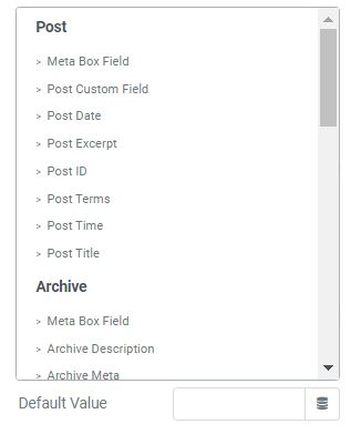
You are able to show the input data to show up directly at your Form.
To get a demo, please click here
The text content will be shown inside the bar until the user clicks on it. You can create an example of data you want the user to put in. Unlike the Default Value, this text does not count as data that fills in the bar. In case the field is required, the user would still have to complete the user’s own information.
You can implement an Icon from our default icon media or your image, and also are able to customize size, position, color of the icon.
When you enable this function, user obviously has to fill out/choose options in this field. Once user ignore it, the system will warn by a default message.
In order to customize format for your input fields, you can set up condition into Pattern box.
For example:
[A-Z]* Uppercase letters are valid for your field.
[0-9]* Numbers are valid for your field.
^.{8,16}$ Limit min and max characters in Password Field.
^\d{5,7}$ Limit min and max number characters in Text Field.
For more information, please reach to
The Autocomplete function provides suggestions while you type into the field.
The data you place here will be automatically added to the field. Users are able to change it; however, this information will be added if users do not replace it.
If you have a Pro Elementor version, you can combine dynamic tag function to get data.

