An acceptance field type is a simple checkbox dedicated to confirming the submitter’s consent for a specific condition. Websites need to take permission from the users to pick their private data. This field type ensures your users accept certain requirements of your choosing. This requirement can be your Terms Of Use, authorization to send them emails, or any other approval, offering you future protection as a site owner.
Acceptance field essentially requires business owners to provide customers with comprehensive information before they make a decision. The law as it stands requires that.
So, let’s see what the best way to create an Acceptance field with Piotnet Addons.
Tutorials
If you have enabled Piotnet Addons so it is very easy to drag and drop a field into the form, then set the field type to Acceptance.
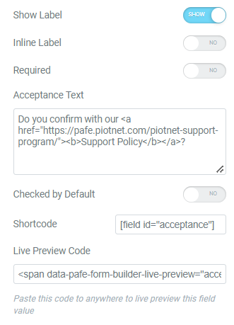
You can also combine <a> tag with acceptance field type.
For example: Do you confirm with our Support Policy?
					Do you confirm with our
<a href="https://pafe.piotnet.com/piotnet-support-program/">
    <b>Support Policy</b></a>?


As expected from an acceptance field, you can set it to be a required field. You also have the option to set the acceptance field as checked by default.
Besides using this field as an acceptance field, it also functions as a single checkbox field that can be used for any other purpose.
It is critical that your website is GDPR (acceptance field) compliant. We hope this article has assisted you in creating or maintaining a WordPress website for your company. With these considerations in mind, begin working on your WordPress today.
In addition, you can also find this feature in other Piotnet plugins such as Piotnet Form which has all features of PAFE Form Builder. But Piotnet Forms works fine with all page builders or gutenberg by using the form shortcode, PAFE requires Elementor installed.
More Information related
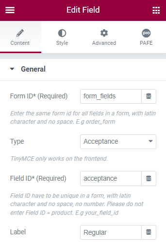
 General
Form ID: Applying only one Identity of the Form value is a basic mandatory in order for your Form to work normally. Enter the same Form ID for all fields in a form.
How to name your Form ID: Be aware that you can use only Latin characters for this name. Numbers and underscores are also acceptable but do not leave spaces. If you want to use multiple words to name the field, divide them with an underscore.
E.g., order_form (use an underscore instead of a dash/hyphen)
Type: Choose Acceptance
Field ID: Identity of the Field has to be unique in a Form. Duplicated Field IDs will make your Form not to work properly.
How to name your Field ID: Be aware that you can use only Latin characters for this name. Numbers and underscores are also acceptable but do not leave spaces. If you want to use multiple words to name the field, divide them with an underscore. Furthermore, please do not enter Field ID = product.
E.g., your_field_id (use an underscore instead of a dash/hyphen)
Shortcode: You could get the input data of the field by embedding this shortcode into a hidden field, calculated field, email, or other actions in Submit Button
Label: It is a name that appears above the field bar and is visible to users.
Show Label: Depending on your purpose, you can show the Label of the field or not by this function.
Inline Label: As the name of the function, it helps your Label and input field be placed in the same row.
Required: When you enable this function, a website visitor obviously must fill out/choose options in this field. Once the user ignores it, the system will warn by a default message.
Required mark: Show the mandatory mark right on the Label
Acceptance Text: Fill out your content to display on Front-end.
Checked by default: This function will be checked from the beginning.
Live Preview Code: You can show the input data to show up directly on your Form. To get a demo, please click here
 Other Options
Invalid message: an error notification will show up to alert when the format of input data is incorrect.
Autocomplete: The Autocomplete function provides suggestions while you type into the field.
Remove this field from Repeater: Apply for Repeater function.
Remove this field from email message: Apply for Email Action depending on specific option values. For example: when a website user chooses a particular option, and you do not want to show this field in email by this option.
 Icon:
Icon:
You can implement an Icon from our default icon media and are able to customize the width, size, position, and color of the icon.
 Checkbox
Style: There are two styles for Acceptance field type: Native and Square.
You can customize Size, Border Width, Border Color, Checked Background Color, Space, Item Vertical Spacing, Item Horizontal Spacing when applying the Square style.
 Label
Label
You can customize the Label elements: Space between Label and Content, Text Align, Text Color, Typography
 Field
Field
You can customize the Content Elements: Text Align, Text Color, Typography, Background Color, Input Max Width, Input Padding, Input Placeholder Color, Input Placeholder Typography, Border Type, Border Type, Border Type, Border Radius, and Box Shadow.
 Layout
Adjust Margin, Padding, Width, Position, Z-index, CSS ID, CSS Classes
 Motion Effects
Scrolling Effects, Mouse Effects, Sticky: None, Top, Button, Entrance Animation
 Transform
You can set both normal and hover styles for elements: Rotate, Offset, Scale, Scale, Flip Horizontal, Flip Vertical
 Background
You can set both normal and hover styles for Background Type.
 Border
You can set both normal and hover styles for Border Type, Border Radius, Box Shadow
 Mask
Mask
Adjust the Shape, Size, Position or Repeat
 Responsive
Responsive visibility will take effect only on the preview or live page, and not while editing in Elementor.
You can hide it on your Desktop, Tablet, or Mobile.
 Attributes
Set custom attributes for the wrapper element. Each attribute in a separate line. Separate attribute key from the value using | character.
 Custom CSS
Add your own custom CSS here
You can set up PAFE extensions here.
For more information, you can reach out here


