The File Upload Field Type lets your users/customers upload files directly within the form.
For instance: Upload CV, Passport, Proposal, etc.
File Upload Field allows users to attach files to their form submissions, such as photos, PDFs, or other documents. You are only permitted to upload up to 256 MB of data per file upload field. This limit cannot be increased because we use browser-based file uploads, which will time out when larger files are uploaded.
Settings of File Upload field
Add a File Upload field to your form after you’ve opened the form builder. You can add fields to your form by dragging and dropping the field to the desired location in the preview area. Then change the field type to File Upload field.


Related Information

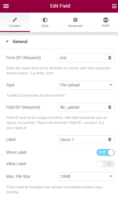
Form ID: Applying only one Identity of the Form value is a basic mandatory in order for your Form to work normally. Enter the same Form ID for all fields in a form.
How to name your Form ID: Be aware that you can use only Latin characters for this name. Numbers and underscores are also acceptable but do not leave spaces. If you want to use multiple words to name the field, divide them with an underscore.
E.g., order_form (use an underscore instead of a dash/hyphen)
Type: Choose File Upload
Field ID: The identity of the Field has to be unique in a Form. Duplicated Field IDs will make your Form not work properly.
How to name your Field ID: Be aware that you can use only Latin characters for this name. Numbers and underscores are also acceptable but do not leave spaces. If you want to use multiple words to name the field, divide them with an underscore. Furthermore, please do not enter Field ID = product.
E.g., your_field_id (use an underscore instead of a dash/hyphen)
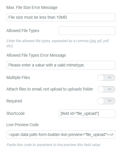
Shortcode: You could get the input data of the field by embedding this shortcode into a hidden field, calculated field, email, or other actions in Submit Button
Label: It is a name that appears above the field bar and is visible to users.
Show Label: Depending on your purpose, you can show the Label of the field or not by this function.
Max. File Size: Limit the maximum file size that the admin will receive with a frame range of 1MB-256MB
Max. File Size Error Message: Set up your content if the uploaded file exceeds the maximum allowance file size.
Allowed File Types: Set which file types the user can upload. This is important in order to make sure you get the proper file from your users and to improve the security of the form. This is our valid file type list: JPG, JPEG, PNG, GIF, PDF, DOC, DOCX, PPT, PPTX, ODT, AVI, OGG, M4A, MOV, MP3, MP4, MPG, WAV, WMV.
Allowed File Types Error Message: Set up your content if the uploaded file is invalid format.
Multiple Files: Let users upload multiple files at once.
Attach files to email, not upload to uploads folder: this function empowers users to display attached files format in the mail instead of URLs
Required: When you enable this function, a website visitor obviously must fill out/choose options in this field. Once the user ignores it, the system will warn by a default message.
Required mark: Show the mandatory mark right on the Label
Live Preview Code: You can show the input data to show up directly on your Form. To get a demo, please click here

Invalid message: an error notification will show up to alert when the format of input data is incorrect.
Autocomplete: The Autocomplete function provides suggestions while you type into the field.
Remove this field from Repeater: Apply for Repeater function.
Remove this field from email message: Apply for Email Action depending on specific option values. For example: when a website user chooses a particular option, and you do not want to show this field in email by this option.

You can implement an Icon from our default icon media and are able to customize the width, size, position, and color of the icon.

You can customize the Label elements: Space between Label and Content, Text Align, Text Color, Typography

You can customize the Content Elements: Text Align, Text Color, Typography, Background Color, Input Max Width, Input Padding, Input Placeholder Color, Input Placeholder Typography, Border Type, Border Type, Border Type, Border Radius, and Box Shadow.

Adjust Margin, Padding, Width, Position, Z-index, CSS ID, CSS Classes

Scrolling Effects, Mouse Effects, Sticky: None, Top, Button, Entrance Animation

You can set both normal and hover styles for elements: Rotate, Offset, Scale, Scale, Flip Horizontal, Flip Vertical

You can set both normal and hover styles for Background Type.

You can set both normal and hover styles for Border Type, Border Radius, Box Shadow

Adjust the Shape, Size, Position or Repeat

Responsive visibility will take effect only on the preview or live page, and not while editing in Elementor.
You can hide it on your Desktop, Tablet, or Mobile.

Set custom attributes for the wrapper element. Each attribute in a separate line. Separate attribute key from the value using | character.

Add your own custom CSS here


